Food and Recipe Website Usability and Perception Study
Challenges:
The product team of Lezizz (Turkish national newspaper Hurriyet’s food and recipe website)wanted to learn more about the usability of the existing interface and how their audience perceives their website before making further changes.
Process:
1. Moderated Remote and Face-to-Face Usability Study
Together with the product team, we decided that the target audience for this recipe and food website would be people working or eager to try new recipes. Based on the insights from the product teams on the existing and targeted user demographics, I decided to recruit 5 participants (3 females and 2 males) working outside of home and having limited time to cook. The Lezizz website was only in Turkish. So I recruited participants from Turkey who would search for recipes in their native language. I also decided to strenghten my sample by recruiting participants from the Turkish expat community as they have considerably limited access to their family recipes and prefer to search Turkish recipes online very often. As I was located in the US, I recruited the expat participants from the US and conducted face-to-face usability and perception study. To schedule and conduct the remote moderated usability tests with the participants living in Turkey, I used UberConference.
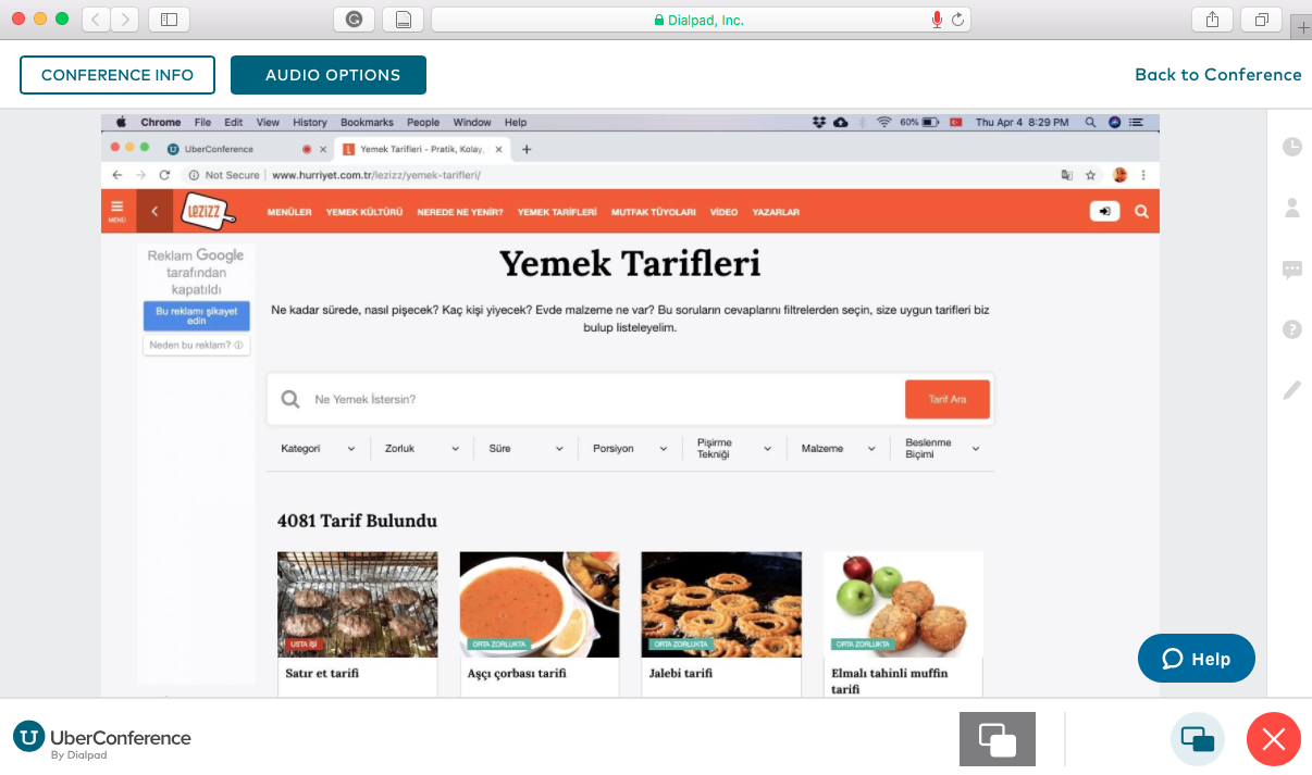
At the beginning of each study, I conducted a pre-test interview with each participant to collect data on their recipe searching habits as well as their favorite recipe and food apps and websites. Following the initial interview, I gave them 3 seperate scenarios and ask to complete specific tasks such as finding a recipe on the website, searching for an article, and using recipe search engine to find appetizer recipes for their vegetarian guests. Throughout the study, I probed questions for participants to comment on different aspects of the website and asked their feedback on the design and user friendliness.
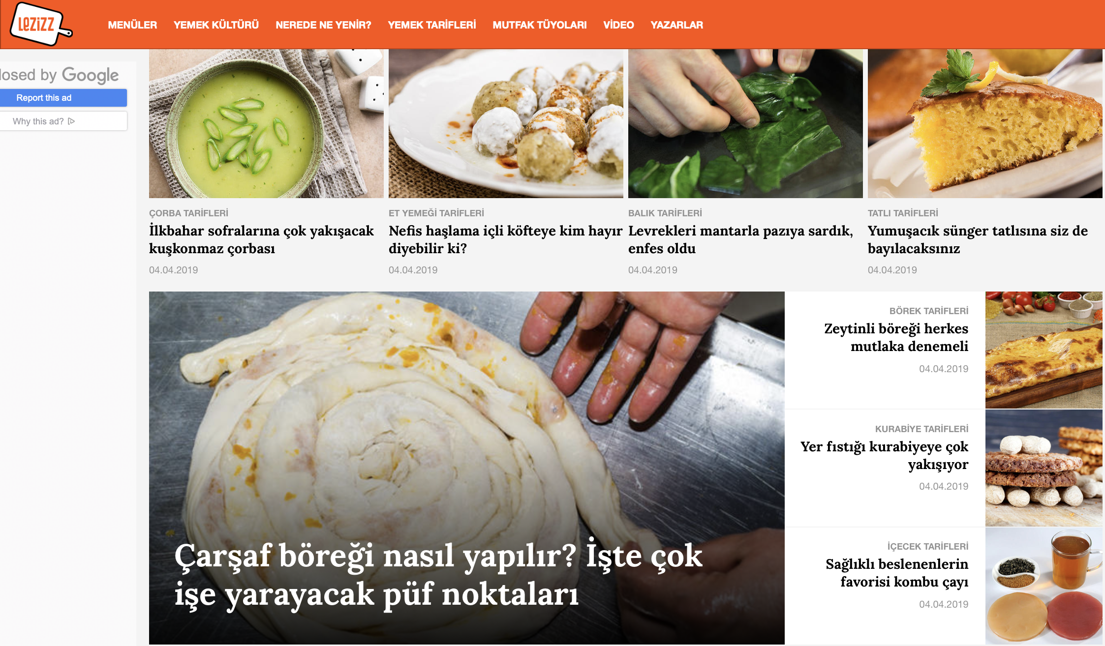
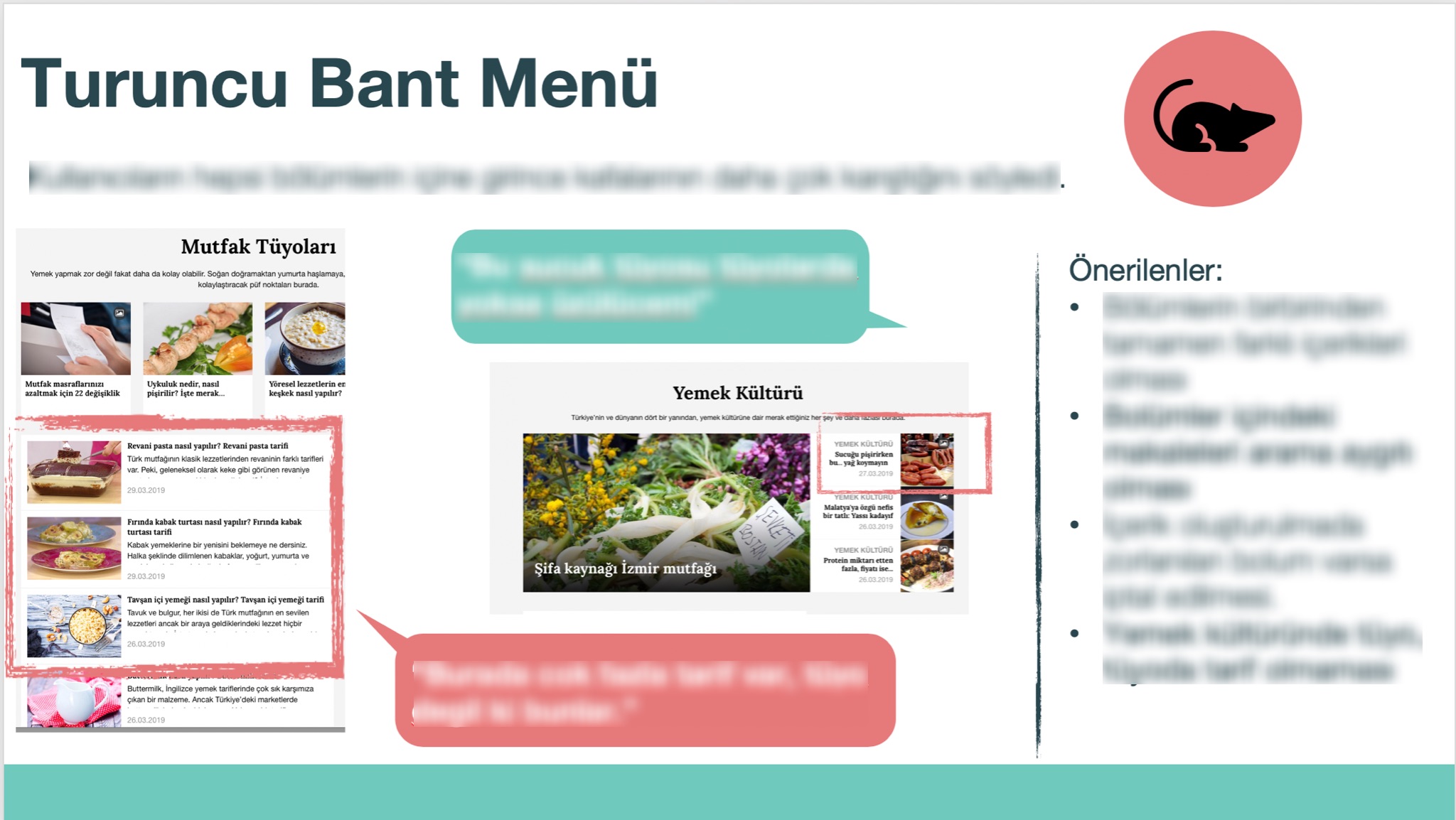
One of the Key Insights: Users find it hard to differentiate the tabs.
“I do not understand the difference between ‘Food Culture’ and ‘What to Eat Where?’” –Participant #2
“There are more recipes than tips under ‘Kitchen Tips’ tab. I would expect to see more life hacks and tricks here.” –Participant #5
Following the test, I conducted post-test interview with each participant to learn more about their expectations from their ‘ideal’ recipe and food website.
Output:
Based on what I had learned along the study, I put together a detailed powerpoint presentation on the main usability problems and ways for making the website more appealing for the target audience. For each issue area, I underlined short and long-term solutions, suggested new directions for research to develop the new UI in a way that would satisfy the potential users and increase the session time and the number of returning visitors.
Outcome:
The product leaders decided to work incorporate some of the suggestions immediately and some others during their next design cycle that will start around mid-2019. I can’t wait to see the results!